What I actually achieved;
I am really happy with how this
shoot turned out. I achieved my goals, which were to show form, tone and colour
and create a shoot that contrasts to my previous one where I used the same
models. Although I did originally want to do this shoot on location in London,
I am glad I didn’t. This shoot I think has worked out better than it would have
if I used a location rather than the studio. I used the white background as it
makes the models stand out more and makes it seem brighter and works best with
the smart fashion I am showing. I did
use a prop, which was a small gold frame.
I did not plan this, but decided to see what it would look like in the
shoot and it worked really well. During editing these photographs, I mainly
desaturated them, but so that they still has some colour. I did this as it
works well with what my shoot is showing.
I really like this edit as it looks fun and quite
natural. I chose these photos as it looks like the model is in front of a
mirror, which looks more natural. I got this idea from some of Mario Testino’s
work. This image in contrasts my other photographs from this shoot, as it is
more fun, whereas the other shoots are in general more serious. Overall I like
the composition of these images together, and it looks almost like a collage
with no general pattern or specific way in which I laid the photographs out. I
also like the high contrast and vivid colours used, which is what makes this
stand out and makes it seem more dramatic.
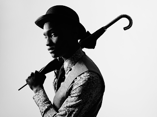
This is another photograph I really like. I like
this one as it is simpler than the others I have taken. I like how it looks
quite casual, due to the angle and the way the model has turned his head
towards the camera. I chose to make it
black and white as it enhances the classy and dramatic feel to the photograph.
For this photograph I only had on one light, which is the one that the model is
facing. This helps illuminate his face and create more shadow on the side of
his face, emphasizing form and tone. When editing I mainly worked on his eyes,
using the dodge tool to make them brighter and lighter, making them stand out
while at the same time keeping them quite natural. I also used the dodge tool
to enhance the highlights in his hair. I chose to make this photograph quite
bright as it makes it seem less heavy and not as harsh. I did try out soft
focus on this as well, but it made the photo seem too false and I wanted it to
be quite natural.
This photo
is what I done the most editing on, and it is my favourite photograph. I like
the composition in this photograph and how he is slightly to the left instead
of in the centre. I also like how he is
turned towards the camera rather than straight on. I desaturated this slightly
as it shows the colour better and emphasizes the ideas of classier more refined
fashion. I experimented with adding the light flares which turned out really
well, they fill up some of the composition and add more light and drama to the
image without overpowering or covering up the model.
Other than desaturating the image
and adding the light flares, I did not over edit this image, as the whole aim
of this shoot was to look quite natural and realistic.
As I am really happy with this
shoot and the previous one that contrasts this, I am finished with this idea. I
do not have any other shoots planned for this unit either, as it is almost
finished. What I will try and work on is improving and expanding my editing
skills.