Thursday, 28 February 2013
Tuesday, 26 February 2013
Review
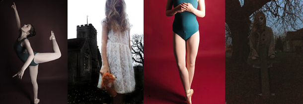
My chosen theme is contrasts. So far I have done four shoots to show this, which were; Death (to contrast the idea of life), clash of personality and location, life and death, and age.
The aim of my first shoot was to present the ideas of death. This shoot is going to go with another shoot I am going to do portraying life. I could not really show the contrast in the shoot as the contrast is shown through the difference in the two separate shoots being put together. I did however show the idea of contrasts through the editing. I kept this mainly quite simple and showed the contrast through colour and black and white. Once the life shoot is complete and edited, the contrast will be stronger and I also plan to create multiple image edits with the two shoots.
Another shoot I done was to show the contrast between my model and the location. To show this I got the model to dress quite girly, and come to Brick Lane. I chose this location as it is very urban and covered in street art which clashes with the girly style of the model. I am happy with how this turns out as I managed to show what I wanted which was to show the model out of her comfort zone in an environment that clashes with her personality. I showed this primarily through the shoot, but I also enhanced this in editing which worked well as I strengthened the contrasts that were already visible. I do want to explore this them a bit more.
For the life and death shoot I wanted to portray this idea through using roses. I first took photographs of the flowers looking natural and untouched to show the ideas of life and positivity. Then to show the idea of death and negativity I gradually started picking off the petals and smashing the roses up. I am happy with how this went as the ideas i wanted to show clearly come through in the shoot. During editing I have enhanced the contrast by using colour editing and layering the separate ideas.
For the age shoot I got an baby and my nan to be my models to show the obvious contrast between young and old. So far I have only taken the photographs and not yet edited. I managed to get the idea of age across well, and it is obvious. When editing I plan on keeping the images quite natural and realistic as the contrast will already be visible.
Friday, 15 February 2013
Target February 15th 2013
Today my target is to do some more edits, looking at different effects. I am also planning on doing a shoot using flowers, firstly I am going to shoot them looking healthy and natural, them I am going to make them look trashy.
My personal target is too plan more before my shoot so I have more of an idea of what I am going to do during the actual shoot and produce better photographs.
My personal target is too plan more before my shoot so I have more of an idea of what I am going to do during the actual shoot and produce better photographs.
Tuesday, 12 February 2013
Brick Lane Shoot 10th February 2013
Over the weekend I done a last minute impulse shoot at Brick Lane, London. This shoot links in with the theme of contrast as the aim was to show the contrast between the urban area covered in street art and the model who looks girly, vintage and slightly out of place. I think this contrast was clearly shown and emphasised in editing. Although I got some good photographs from this shoot, I took less than I hoped as the shoot was cut short due to the rain. Even though I got good photographs, I am classing this as sort of a 'draft' shoot due to the weather cutting it down, and I plan to go back and do another shoot the same.
This is possibly my favourite from the shoot, mainly because I love the street art shown. As I wanted to show the quote in full, yet show the model, I put her to the side looking at it. I wasn't sure if the composition would work, and make her look out of place but it actually worked. As the model is shown as much as this, making the contrast not as strong, the contrast shown mainly in this is the way the quote looks slightly out of place in the area. To make it contrast more visible, when editing, I increased the contrast a lot.
I really like how bright and almost psychedelic this image is, showing an image repeated and then that repeated even more. I chose to use this photograph for this multiple image experiment as it contrast the rest of the photographs, showing the model in a more fun way rather than so serious. The contrast is shown in this image through the editing, with the ligher brighter colours contrasting the high contrast, darker images.
Work Record February 8th 2013
Preparation;
My exam title is Contrast, and so I want to explore various different contrasting ideas, and develop them and eventually chose a favourite idea for my exam piece. For this shoot I am going to explore the idea of life and death. For this I am going to use myself as a model and paint on a skull to show the death side. Then next week I am going to show the life side.
I like these two photos as they are not too bright, and they are quite grey which emphasises the death aspect of the photos. I like the left photo as it looks quite dirty and rough making it seem harsher in general. I like the one on the right as it looks more refined and lifeless due to the angle, and expression of the model. I also like how the skull design extends to her neck.
To Prepare I Need To;
- Book the studio
- Decide if I want to use any props
- Decide on the design
- Think about angles and compositions.
I hope to Achieve;
During this shoot I hope to achieve a dark and sinister shoot representing death through the idea of skulls. This shoot will then contrast the shoot I am planning on doing next week that will be brighter and representing the contrasting idea of life.
What I Achieved;
I am really happy how my shoot went, and I achieved my goal which was to create a shoot showing the idea of death, which I will later do a shoot for life as they contrast and my exam title is Contrasts. The shoot went how I wanted, and I managed to create the look I wanted with face paints. I choose to use a red background as it connotes death, and shows up the dark and light colours. I used a variation of both lights and just one light to show up form and shadow more, creating darker and brighter looks. I originally was not planning on using props for this shoot, but I did have an idea to use a rope so it looks like I had been hung as that emphasises the death. I also used the rope wrapped around my hands and face to show the confinement that can be related to death. Although these ideas worked out, they were not the best. At last minute I also decided to include some fake blood in the shoot. I think this worked out well as the blood extends the ideas of death and makes it seem more surreal. Overall, I got enough photos that represent the ideas that I wanted to show and think they went really well. When editing, I experimented with different effects such as Gaussian blur and adjusting the curves and levels to get different, unnatural looks.
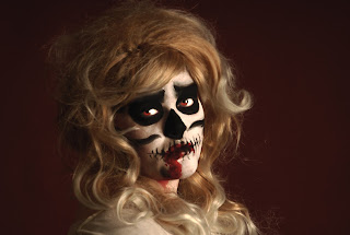
 This is my favourite photograph from the shoot. This is due to the editing and the composition and light used in the shoot. For this photograph I used both lights and that minimised shadow. I really like the position I am in, turned away from the camera but with my head towards it makes it seem more natural and looks like I was distracted and almost caught off guard by the camera. When editing, I touched up the makeup in slightly patchy areas and made the red blood more vivid. I then changed my eye colour to red as it emphasises the living dead feel. Once I was happy with how it looked, I then desaturated it slightly, but not so much that all the colour went away. This is definitely my favourite photo from this shoot.
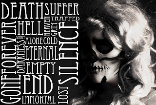
 This is another photograph that turned out really well. For the shoot I only had one light on to the right. I feel that the lighting is what made this photo good as it creates a lot of shadow to the right of my face, and that along with the fact I am looking down and seem almost upset it gives the feel that I am hiding. When editing my original plans were not to add text, but after increasing the contrast, desaturating the image and brightening my hair with the dodge tool, I decided to experiment with adding text in the gap. I think the text works well and fills the space takes up a lot of the composition. The words all relate to the image as they are mainly negative words associated with death which go with the ideas represented.
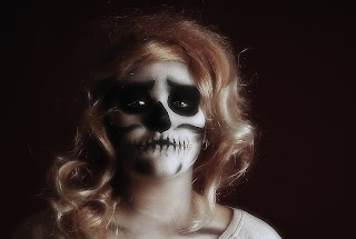
  This is another photograph I like which looks a lot more simple and natural. When shooting this I had just the right light on which helps emphasise the form, and due to the distance I was standing away from the lights and camera, the shadow is not harsh and overpowering. My favourite thing about this photo is the my position and expression. I like how I am looking down at the camera slightly making me seem powerful, yet the sad expression on my face sort of contradicts that. When editing, I made my eyes stand out more by using the dodge tool. I kept the editing for this simple, by just adjusting the curves and saturation, then to I softened the image with Gaussian blur. The fact that this is softer than the rest makes this stand out more as in a way it does not show the idea of death in such a harsh way compared the other photographs.
 What I am going to do next;
I am really happy with how this shoot went and, my next step is to develop the idea of life, then plan and do the shoot to present it. I am going to use myself again for this to keep the link between the two shoots clear and consistent. I also plan on - once the photos for the life shoot are edited - doing some edits of the life and death photographs together.
Target February 12th 2013
Today my target is to complete my edits from my last shoot - 8th February - and also complete the work record for it. I also plan on editing and writing about an extra shoot I done on sunday the 10th. I also hope to plan my next shoot for this friday which will show the contrasting idea to my last shoot - life and death.
My personal target this lesson is to expand my photoshop skills and try new ideas and editing techniques.
My personal target this lesson is to expand my photoshop skills and try new ideas and editing techniques.
Friday, 8 February 2013
Target February 8th 2013
My target for today's lesson is too do a shoot that shows the contrast between life and death. To do this I am going to do a shoot using myself as a model and paint on a skull to show the death part of the contrast. I aim to edit or at least start editing these photographs today. I am also going to plan my shoot for next week showing the contrasting idea of life.
The result I aim to get from this shoot is a starting point to develop the idea of life and death.
My personal target is to improve on my photoshop skills, making my editing more refined.
The result I aim to get from this shoot is a starting point to develop the idea of life and death.
My personal target is to improve on my photoshop skills, making my editing more refined.
Subscribe to:
Comments (Atom)


