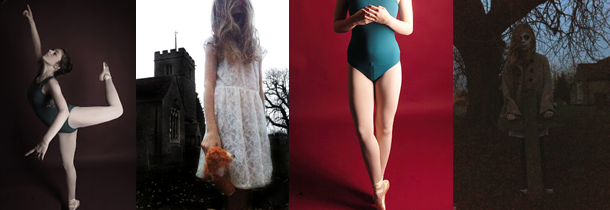
The aim of my first shoot was to present the ideas of death. This shoot is going to go with another shoot I am going to do portraying life. I could not really show the contrast in the shoot as the contrast is shown through the difference in the two separate shoots being put together. I did however show the idea of contrasts through the editing. I kept this mainly quite simple and showed the contrast through colour and black and white. Once the life shoot is complete and edited, the contrast will be stronger and I also plan to create multiple image edits with the two shoots.
Another shoot I done was to show the contrast between my model and the location. To show this I got the model to dress quite girly, and come to Brick Lane. I chose this location as it is very urban and covered in street art which clashes with the girly style of the model. I am happy with how this turns out as I managed to show what I wanted which was to show the model out of her comfort zone in an environment that clashes with her personality. I showed this primarily through the shoot, but I also enhanced this in editing which worked well as I strengthened the contrasts that were already visible. I do want to explore this them a bit more.
For the life and death shoot I wanted to portray this idea through using roses. I first took photographs of the flowers looking natural and untouched to show the ideas of life and positivity. Then to show the idea of death and negativity I gradually started picking off the petals and smashing the roses up. I am happy with how this went as the ideas i wanted to show clearly come through in the shoot. During editing I have enhanced the contrast by using colour editing and layering the separate ideas.
For the age shoot I got an baby and my nan to be my models to show the obvious contrast between young and old. So far I have only taken the photographs and not yet edited. I managed to get the idea of age across well, and it is obvious. When editing I plan on keeping the images quite natural and realistic as the contrast will already be visible.

No comments:
Post a Comment