Preparation;
 The purpose of this shoot is to get images of me as a zombie
and looking normal. This is to show the contrast between the dead and the
living. To show the contrast effectively, I am going to create an animation.
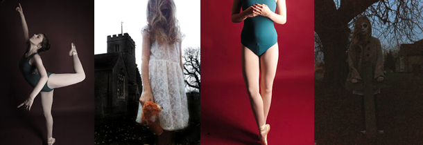
The image on
the top relates to what I plan on doing as it is natural and normal, which is
what part of my shoot is going to be, as I want the contrast to be strong and
obvious. The image on the bottom relates as it is showing zombie/dead makeup and
the model looks lifeless.
To prepare I need to;
- · Plan makeup ideas
- · Book studio
- · Plan any specific poses
What I hope to achieve;
By the end
of the shoot and editing, I hope to get some good photos that I can put
together to create an animation showing the change from “human” to zombie.
What I actually achieved;
I am really
happy with what I achieved with this shoot, as I effectively got two different shoots
done in one – one normal and one with zombie FX makeup. I chose to use a dark
background to make the makeup and expressions stand out more, and because black
goes with both ideas I was showing in this. The poses I done were obvious dead
zombie poses, natural smiley and poses and shut eyes so the transition between
human to zombie would be smooth. As this was exactly what I wanted and needed
to do I did not try out other ideas. I did how ever try out being close to the
camera and further away which created more shadow which was better for the
zombie photos. When editing, I focused primarily on creating the animation
rather than the editing single images.
Animation;
For the
animation, I kept the editing really simple and chose to keep the colours
natural for the natural shoots, but then the images showing the zombie idea I
decided to make my skin seem whiter and greyer, and make the blood more vivid.
I did not need to edit my eyes as I was wearing white out contacts. When
choosing the correct images, I had to choose ones that were similar sizes and
composition to make the transition smooth, but when I was layering them, I did
use free transform to size them to fit better. As this is my first animation, I
am really happy with the result of this.
The animation can be found on this link here;
For this
edit, the idea behind it was “everybody’s got a dark side”. To show this idea,
I decided to use a natural image and keep it natural by just perfecting the
skin and making the eyes stand out more. To show the dark side I layered one of
the zombie images on top and turned the opacity down so that it was visible but
not overpowering. This shows the idea I want well, as it looks like the “darker
side” is fighting though or just slightly visible.
For this edit I wanted to just focus
on the zombie side, and make it seem more “early Hollywood zombie movies”
style. To achieve this I added noise to distort the image and make it seem more
vintage. Before I added the noise, I made the reds brighter and the white on
the eyes whiter. I then desaturated the colour a bit, but not so much that the
red was not vivid.
What I am going to do next;
As I am
really happy with the result of this animation and shoot, I am leaving this
idea now. But I do plan on revisiting the idea of life and death with the
zombie theme as it is one of my favourite and most fun ideas to shoot, create
and edit.


No comments:
Post a Comment