Preparation;
The aim for this shoot is to show
the contrast between mental and physical age. To do this I plan on using
someone aged 17, and dress them to look like a baby to show how they are
physically 16, but mentally they are a baby.
I like these images above as they show adults acting as
babies/toddlers. I like these as they look natural and are in a realistic
environment; however, I will be using a studio. I like the one on the top due
to how it shows a sleepier more calm representation of a child. I like the one
on the bottom as it shows the use of a teddy as a prop which could work in a
number of ways and extends the image and what it can show.
To prepare
I need to;
- ·
Book the studio
- ·
Get a model
- ·
Plan any specific poses
- ·
Get any props
What I hope
to achieve;
From this I hope to achieve a shoot showing the realistic
contrast between mental age and physical age by dressing up a 17 year old as a
baby to show how although she is 17, she is mentally about 3 years old.
What I
actually achieved;
I am really happy with what I achieved during this shoot, and
would go as far as saying it one of the better shoots I have done due to the
outcome. For this shoot I decided to use a white background as it represents
more innocent ideas which are how babies ad toddlers are seen. To keep in with
the bright, fun and innocent theme, I decided to use both lights so it was well
lit and bright. Although I did experiment with using just one light, but it
created too much shadow which was not what I was looking for. I decided to use
props including nappies, a soother, a doll and a “blankie”. I used these as
props as they are general props associated with babies. I got a range of shoots
showing different compositions and ranging from close ups of the head to full
body images. None of these poses worked better than the others and I got a good
and varied range, and achieved what I was aiming to.

This is my
favourite photo from the shoot, mainly due to the angle and composition. What I
really like is how her head looks really big due to the angle and the fact that
I zoomed right out on the camera, and I went right up close to the model. When
editing, I chose use selective colour as I thought it would make it look
dramatic, and keep it looking humorous and silly. I made the pink in the dummy
a lot brighter, and made the light reflecting, shiny areas brighter as well. On
the eyes I used the dodge tool and made them brighter to make the model seem
more excited and more like a child.

I also like this one quite a lot as instead of showing her
as bold, it shows the model using the doll and dummy as if for comfort or
protection, while still keeping the image light and happy. I spent a lot of
time editing this image, and before deciding to turn it into a cluster image, I
spent a lot of time working on editing the face. When editing the face I re
coloured a few areas, and removed dark circles, making her face brighter and
using Gaussian blur to make her seem younger. I then chose to turn this into a
cluster image as I think the image works with the layout.

This is
another image that I really like, due to the editing. I also like how the
composition is looking down on the model, making her seem inferior slightly. For
this, the idea of turning her into a puppet was not planned and instead, we was
experimenting with different poses which are to do with babies and toddlers –
which led to the teapot pose in relation
to the nursery rhyme. When editing, I at first kept it really natural, just
adjusting colours and perfecting areas. But then as I did not want to crop the
image, I decided to turn her into a puppet. To do this I first used surface
blur as it gives a false, plastic effect. I then added lines using shape, and
then warped them on transform.
What I am
going to do next;
I am really happy with how this turned out, and therefore do
not feel the need to go back and re shoot it. I am now going to develop the
idea I previously looked at which is life and death using the idea of zombies.


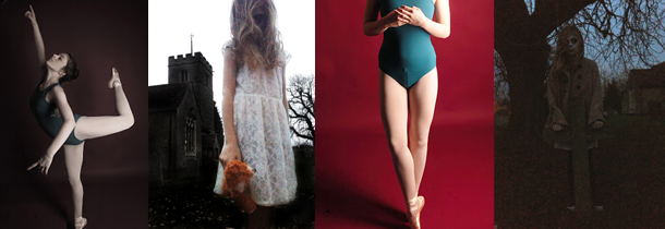


 The purpose of this shoot is to get images of me as a zombie
and looking normal. This is to show the contrast between the dead and the
living. To show the contrast effectively, I am going to create an animation.


