Tuesday, 30 April 2013
Work Record April 26th 2013
Preparation;
This image was not intentionally in colour, and it is also in
black and white. Although it is in black and white, I do prefer this one in
colour due to the vivid colours and how bright it is. For this I used the ring
flash, and therefore this image has no shadow. I like the pose that the model is
posing as it looks fun and natural. I also like how the colours and sunglasses
makes the image look happy and summery.


The aim for this shoot is do a portrait and fashion shoot in
black and white. This relates to contrasts as it will be in black and white. I
plan on using the normal lights and the ring flash to get high quality professional
portrait images.
I like both of these images as they both show bright, high
contrast black and white style portrait photography. I like the one on the top
due to the classier, extreme high contrast style to it. I like the one on the
bottom as I like how the model is posing and with some shadow.
To prepare
I need to;
·
Get a model
·
Book studio
·
Plan lighting
·
Plan what I want my model to wear
·
Plan poses
What I hope
to achieve;
In this shoot I hope to achieve a beauty portrait shoot that
shows modern fashion and beauty through a variety of poses.
What I
actually achieved;
I am really happy with how this shoot turned out, as it shows
contrast well in a different way to how I usually show it. I did originally
plan on taking the photographs in black and white, but I am glad I decided
against it as taking them in black and white as having them in colour gave me
more freedom with editing, such as tone and brightness. I also got a few good
colour images, which was not my aim but as I thought they turned out well I
saved them in colour as well as black and white. When taking the photographs, I
did use various different lighting, but the one that worked out best for me was
the ringflash as it gave a brighter, higher quality finish. When editing, other
than making them black and white, I experimented with different amounts of
shadow, brightness and contrast intensity. Overall I am really happy with the
result I got.


This
is most likely my favourite image from the shoot, as I like the retro feel to
it and how fun it is. Another thing about this I like is the reflection of the
ringflash in the sunglasses looks like eyes which adds to the fun style. In
terms of editing, I am really happy with how this looks due to the high
contrast, bright style of it. The fact that I used the ringflash increased the
contrast and the brightness as well.
This is another image that I think worked out quite well, as
it is not as bright and shows less contrast than the rest of the images. I took
this without the ringflash, but there is still minimal shadow. I like this one
mainly because it shows movement which I think was captured quite well as there
is no blur. When editing, I used the dodge tool to highlight the hair a bit
more.
What I am
going to do next;
There are ways I could develop this idea such as doing the
photographs outside or changing the theme, but as this shoot is the last in my
unit, I am happy with leaving it as it is.
Work Record April 8th 2013
Preparation;
The aim of this shoot is to do a “mock up” of the shoot and editing I plan to do for my exam piece with the topic being Contrasts. This shoot will show the contrast of dead/undead and inside/outside of the body by creating an effect that my face is being unzipped. One of the reasons I chose to do this idea is because it means I can use myself as the model, therefore I would not have to find an available model, and also because it links in with my work where I have focused on the idea of horror and used myself as a model
I
decided to make this one black and white as I think the fact that it has quite
a bit of shadow and shows a lot of form goes well. To get this lighting, I
stepped closer to the camera and just beyond where the lights were which turned
out to give a halo type of effect which I think works well. When editing, I
used the dodge tool on the hair to make it a bit brighter and enhance the halo effect.
The aim of this shoot is to do a “mock up” of the shoot and editing I plan to do for my exam piece with the topic being Contrasts. This shoot will show the contrast of dead/undead and inside/outside of the body by creating an effect that my face is being unzipped. One of the reasons I chose to do this idea is because it means I can use myself as the model, therefore I would not have to find an available model, and also because it links in with my work where I have focused on the idea of horror and used myself as a model
This image on the left gives me inspiration on how I am going
to do my makeup. This is the most crucial part to get right, as if it goes
wrong, it will mess up the entire shoot and the edits will not look as good
either. Although it does not really go with my idea, I have chosen to include
this image on the left as I like the way it is lit. Up-lighting is something I
want to experiment with in this shoot as I like the eerie look it gives the
images.
To Prepare
I need to;
·
Decide on the lighting
·
Book studio
·
Decide on what background
·
Plan poses
·
Plan/do a practice run of the makeup
·
Decide on any specific editing I want to look at
What I hope
to achieve;
From this shoot I hope to achieve shoot giving me a clear
indication of how I am going to do my exam shoot, including things such as
whether or not this shoot is a good idea, lighting, backdrop, and edits.
What I actually achieved;
I am really happy with how this shoot
turned out, and not I have a clear idea and plan of what I am doing foe my exam
piece. Due to the fact I feel this was a successful trial of this idea, I am
going to continue with this idea. When it came to shooting, I got a range of
images with different compositions and poses as well as different lighting. I
chose to use the grey background for this shoot as it is not too dark, but with
different lighting and editing I have the option and it worked really well.
When it came to lighting that is something I am really happy with how it turned
out as I experimented with having the light coming up to give the images a
darker, more horror style feel. With the editing, I had to use the clone stamp
tool, spot healer and paint on them all to smooth out the zipper so it appeared
as part of the skin and looked realistic. This was something I was not sure
would work out too well and one of the main reasons I wanted to text my idea,
but it worked out a lot better than I thought it would.
This is one of my favourite images from this shoot as it was
done with the lighting going up. It makes the image look more sinister and
evil, which is different to the rest where I have tried to make them seem more innocent.
I also like the composition with this as I am central and looking up above the
camera which I think looks good.
What I like most about this is how it looks quite bright and
normal – except the zipper area which is what I was going for as it shows the
contrast well and in a natural way. I also like this as it is quite close up
and you can see the zipper in more detail,
and it smoothly goes into the skin.
What I am
going to do next;
As I am really happy with how this shoot has turned out, and
how the editing went, I am happy to go ahead with this idea for my exam as it
is goes with the theme of Contrasts and during the editing process, there are
quite a few ways I can enhance the idea and images.
Monday, 29 April 2013
Work Record April 8th 2013
Preparation;
This is another image that I really like, although it does stand out against the rest of the images as it is not to do with nature or the scenery of where I was. I took this with the macro lens, focusing in on the tear in the shoe, which is obvious as it is central of the composition. As this image without editing did not have much to do with contrasts, so during editing I decided to use the selective colour technique which also emphasised the subject.
I think this is a really effective image, as it is simple yet shows good detail and strong colour. I also took this using the macro lens as I wanted to capture the detail of the flower precisely. When editing, I made the background more blurred using Gaussian blur. When it came to colour, I only had to enhance it slightly using levels and curves.
What I am going to do next;
The aim for this shoot is to show nature and the contrasts I
see within it, such as colour and the contrasts between natural and manmade. I
decided to do this as the majority of my work is in the studio and I want to
explore shooting outside a bit more.
I don’t really have any specific plans with this shoot, but I
do plan on using the macro lens when photographing things such as flowers as I
like the way it makes the camera focus on the subject and its detail whilst
slightly blurring the background.
To Prepare
I need to;
- Plan where I am going to go
What I hope
to achieve;
From this shoot I hope to achieve a range of photographs
showing various contrasts within nature.
What I actually achieved?
I am really happy with how my shoot went, especially as it was something I am not used to doing, and I got a variety of images showing various contrasts and compositions. As I got a range of photographs showing different things ranging from churches to flowers, this shoot shows a range of different contrasts such as contrast between light and dark. When editing, I did keep them consistent, as each image is different and needed different editing, so it ranged from just using levels and curves, to using different filters to create different effects. Overall, I am really happy with how this shoot has turned out and the range of images I got.
This is one of my favourite images from the shoot, and it did
not take much editing. What I like most about this is the sun shining over from
one corner through the trees and slightly hitting the pipe, emphasising the
form. I also like the composition, with the camera looking down the pipe
showing depth. When it came to editing, I just enhanced the contrast using
levels and curves, as it did not need over editing, just enhancing slightly. I am really happy with how my shoot went, especially as it was something I am not used to doing, and I got a variety of images showing various contrasts and compositions. As I got a range of photographs showing different things ranging from churches to flowers, this shoot shows a range of different contrasts such as contrast between light and dark. When editing, I did keep them consistent, as each image is different and needed different editing, so it ranged from just using levels and curves, to using different filters to create different effects. Overall, I am really happy with how this shoot has turned out and the range of images I got.
This is another image that I really like, although it does stand out against the rest of the images as it is not to do with nature or the scenery of where I was. I took this with the macro lens, focusing in on the tear in the shoe, which is obvious as it is central of the composition. As this image without editing did not have much to do with contrasts, so during editing I decided to use the selective colour technique which also emphasised the subject.
I think this is a really effective image, as it is simple yet shows good detail and strong colour. I also took this using the macro lens as I wanted to capture the detail of the flower precisely. When editing, I made the background more blurred using Gaussian blur. When it came to colour, I only had to enhance it slightly using levels and curves.
What I am going to do next;
As this was a one off shoot, there is not much else I can do
to continue this, as the idea cannot really be developed further so I will move
onto a new idea.
Work Record March 26th 2013
Preparation;
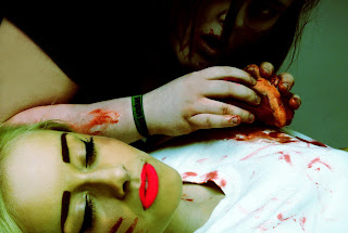
The aim of this shoot is to show the contrast between life
and death by creating a scene were a zombie is eating a human. For this shoot I
plan on using myself and someone else as models.
To prepare
I need to;
·
Get a model
·
Book the studio
·
Get any props – i.e. heart
·
Plan makeup
·
Plan poses
What I hope
to achieve;
During this shoot I hope to achieve a shoot that shows the
contrast between life and death through the ideas of horror.
What I actually achieved;
During this shoot, I managed to achieve what I wanted which was to show the ideas of life and death in a eccentric and horror themed shoot. Due to the fact I was also part of the shoot, I was originally planning on putting the camera on a stand, but the stand would not go as low as I needed it too, I instead asked Paul to take the photographs with me directing him. I am happy with how the images turned out, however there was not much variation in pose and composition due to the fact I knew what I wanted to get out of the shoot. When shooting I used a heart as a prop to make it look more realistic like the zombie was eating the heart. When editing I experimented with adding backgrounds and re colouring them. This is my favourite edit from the shoot as I re coloured it and gave it and green hue in order to make it look more eerie, whilst keeping it bright and vivid. I also like how the composition is, with the heart central, making it the focus with everything happening around it and linking the zombie and the human. I also like how at the top of the image you can just see my eyes, and it looks as though I have been caught off guard.
What I am going to do next;
As I am happy with how this has turned out, I am leaving this
shoot as it is, but I like looking into the idea of horror so I am going to
continue looking at this style.
Work Record March 12th 2013
Preparation;
The aim of this shoot is to show the contrast between fire and ice/ good and evil by using a model and makeup. I have decided to so this so that I can show contrast in a different way to how I previously have, and also use a model.
 This is another image I like a lot. I like this one as it
looks really natural, but them the fact that the eyes are two different colours
gives it a sort of supernatural edge. For this I kept editing quite simple,
just touching up colour and using Gaussian blur to soften the image. I also
like the composition for this image as there is some blank space left so the
model is not filling the composition entirely.
The aim of this shoot is to show the contrast between fire and ice/ good and evil by using a model and makeup. I have decided to so this so that I can show contrast in a different way to how I previously have, and also use a model.
I like these two images as they both show similar ideas of
what I hope to achieve. The image on the bottom shows a similar idea of what I
hope to achieve in my shoot as I like how the each side of the face is
representing different ideas, this is something I hope to achieve as it shows
how one person is capable of both good and evil. The image on the top shows a
more detailed look of what I hope to achieve in terms of makeup design.
To prepare
I need to;
·
Get a model
·
Book the studio
·
Plan what I want the model to wear
·
Plan any poses
·
Plan a makeup design
What I hope
to achieve;
By the end of this shoot I hope to get have a range of photos
showing the contrast between good and evil using contrasting colours and
makeup.
What I
actually achieved;
I am quite happy with how this shoot went, as I got what I
wanted which was to show the ideas between good and evil through the model and
makeup designs and for it to look effective. Although I am really happy with
how the shoot went and in general with editing, there was one edit which I have
included but did not turn out exactly how I hoped, as it looks false and messy.
During shooting I got a wide range of shoots using both lights and just one to
show more form. I also got a variety of different angles and compositions so
that I got photos showing both ideas together and on their own. I decided to
use a white background as it reflected the light better and goes well with both
the good and the bad ideas in this shoot. During editing, I decided to play
around a bit with different effects and tools to create more natural and
eccentric ideas. These generally worked out really well and overall, I am happy
with the result.
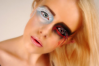
This is most likely my favourite image from this shoot as I really like how it turned out, especially in terms of editing, as I spent quite a while editing this, such as using the clone stamp tool to even out the patchy glitter, used the brush and eyedropper tool to enhance the colour. What I like most about this image is how the colour and the strong colours on the eye make this seem a bit surreal and more like some fairy-tale type of shoot.
 This is another image I like a lot. I like this one as it
looks really natural, but them the fact that the eyes are two different colours
gives it a sort of supernatural edge. For this I kept editing quite simple,
just touching up colour and using Gaussian blur to soften the image. I also
like the composition for this image as there is some blank space left so the
model is not filling the composition entirely.
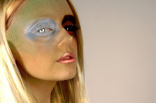
Although this probably is not the best image from the shoot,
it is something I really like as it turned out better than I expected. The aim
from this computer experiment was to make the model look a bit like a reptile.
I done this using the texture tool, and layering it about the image repeatedly,
each layer creating a more graduated effect. I them use the clone stamp to
erase the nostrils. Other than the editing, I like the composition of this, how
the model is off to one side and looking directly at the camera as it makes the
model look powerful.
What I am
going to do next;
As I am happy with how this shoot turned out, I am not going
to continue with this idea as I do not think there is much I can do to develop
this idea. Next, I am now going to create an animation to show contrasting
ideas of living and dead.
Friday, 26 April 2013
Todays Targets (April 26th 2013)
In todays lesson, I have a shoot planned influenced by Richard Avedon's work, which is mainly black and white photography focusing on fashion. In terms of editing, I plan on keeping it simple as the main point of this shoot is black and white.
I also plan on getting some contextual work done, mainly the work records and I am also going to start picking out my final pieces after I complete todays shoot as it is my last shoot for Unit 2.
I also plan on getting some contextual work done, mainly the work records and I am also going to start picking out my final pieces after I complete todays shoot as it is my last shoot for Unit 2.
Outstanding Work Unit 2
All of my work is complete!
Tuesday, 23 April 2013
Thursday, 18 April 2013
Tuesday, 16 April 2013
Exam Plan
My theme for my exam is contrasts, and to show this I am going to use myself as the model and use the studio with the grey background. To represent this theme of contrasts, my idea is to use theatrical makeup so that it looks as if my face has been unzipped, revealing the inside. This will show the contrast between whats on the surface and whats underneath - literally.
Previous to this, I plan on doing a mock shoot to practice my idea and make sure I can do it and so that I have more of a plan of the poses I want to do.
When editing, I plan on doing a variety of edits both "natural" looking, black and white, and maybe an animation as well as a variety of other experiments.
Friday, 12 April 2013
Subscribe to:
Comments (Atom)


