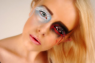
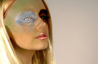
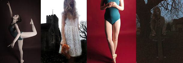
The aim of this shoot is to show the contrast between fire and ice/ good and evil by using a model and makeup. I have decided to so this so that I can show contrast in a different way to how I previously have, and also use a model.
I like these two images as they both show similar ideas of
what I hope to achieve. The image on the bottom shows a similar idea of what I
hope to achieve in my shoot as I like how the each side of the face is
representing different ideas, this is something I hope to achieve as it shows
how one person is capable of both good and evil. The image on the top shows a
more detailed look of what I hope to achieve in terms of makeup design.
To prepare
I need to;
·
Get a model
·
Book the studio
·
Plan what I want the model to wear
·
Plan any poses
·
Plan a makeup design
What I hope
to achieve;
By the end of this shoot I hope to get have a range of photos
showing the contrast between good and evil using contrasting colours and
makeup.
What I
actually achieved;
I am quite happy with how this shoot went, as I got what I
wanted which was to show the ideas between good and evil through the model and
makeup designs and for it to look effective. Although I am really happy with
how the shoot went and in general with editing, there was one edit which I have
included but did not turn out exactly how I hoped, as it looks false and messy.
During shooting I got a wide range of shoots using both lights and just one to
show more form. I also got a variety of different angles and compositions so
that I got photos showing both ideas together and on their own. I decided to
use a white background as it reflected the light better and goes well with both
the good and the bad ideas in this shoot. During editing, I decided to play
around a bit with different effects and tools to create more natural and
eccentric ideas. These generally worked out really well and overall, I am happy
with the result.
This is most likely my favourite image from this shoot as I really like how it turned out, especially in terms of editing, as I spent quite a while editing this, such as using the clone stamp tool to even out the patchy glitter, used the brush and eyedropper tool to enhance the colour. What I like most about this image is how the colour and the strong colours on the eye make this seem a bit surreal and more like some fairy-tale type of shoot.
 This is another image I like a lot. I like this one as it
looks really natural, but them the fact that the eyes are two different colours
gives it a sort of supernatural edge. For this I kept editing quite simple,
just touching up colour and using Gaussian blur to soften the image. I also
like the composition for this image as there is some blank space left so the
model is not filling the composition entirely.
Although this probably is not the best image from the shoot,
it is something I really like as it turned out better than I expected. The aim
from this computer experiment was to make the model look a bit like a reptile.
I done this using the texture tool, and layering it about the image repeatedly,
each layer creating a more graduated effect. I them use the clone stamp to
erase the nostrils. Other than the editing, I like the composition of this, how
the model is off to one side and looking directly at the camera as it makes the
model look powerful.
What I am
going to do next;
As I am happy with how this shoot turned out, I am not going
to continue with this idea as I do not think there is much I can do to develop
this idea. Next, I am now going to create an animation to show contrasting
ideas of living and dead.


No comments:
Post a Comment