The aim of this shoot is to do a “mock up” of the shoot and editing I plan to do for my exam piece with the topic being Contrasts. This shoot will show the contrast of dead/undead and inside/outside of the body by creating an effect that my face is being unzipped. One of the reasons I chose to do this idea is because it means I can use myself as the model, therefore I would not have to find an available model, and also because it links in with my work where I have focused on the idea of horror and used myself as a model
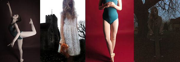
This image on the left gives me inspiration on how I am going
to do my makeup. This is the most crucial part to get right, as if it goes
wrong, it will mess up the entire shoot and the edits will not look as good
either. Although it does not really go with my idea, I have chosen to include
this image on the left as I like the way it is lit. Up-lighting is something I
want to experiment with in this shoot as I like the eerie look it gives the
images.
To Prepare
I need to;
·
Decide on the lighting
·
Book studio
·
Decide on what background
·
Plan poses
·
Plan/do a practice run of the makeup
·
Decide on any specific editing I want to look at
What I hope
to achieve;
From this shoot I hope to achieve shoot giving me a clear
indication of how I am going to do my exam shoot, including things such as
whether or not this shoot is a good idea, lighting, backdrop, and edits.
What I actually achieved;
I am really happy with how this shoot
turned out, and not I have a clear idea and plan of what I am doing foe my exam
piece. Due to the fact I feel this was a successful trial of this idea, I am
going to continue with this idea. When it came to shooting, I got a range of
images with different compositions and poses as well as different lighting. I
chose to use the grey background for this shoot as it is not too dark, but with
different lighting and editing I have the option and it worked really well.
When it came to lighting that is something I am really happy with how it turned
out as I experimented with having the light coming up to give the images a
darker, more horror style feel. With the editing, I had to use the clone stamp
tool, spot healer and paint on them all to smooth out the zipper so it appeared
as part of the skin and looked realistic. This was something I was not sure
would work out too well and one of the main reasons I wanted to text my idea,
but it worked out a lot better than I thought it would.
This is one of my favourite images from this shoot as it was
done with the lighting going up. It makes the image look more sinister and
evil, which is different to the rest where I have tried to make them seem more innocent.
I also like the composition with this as I am central and looking up above the
camera which I think looks good.
What I like most about this is how it looks quite bright and
normal – except the zipper area which is what I was going for as it shows the
contrast well and in a natural way. I also like this as it is quite close up
and you can see the zipper in more detail,
and it smoothly goes into the skin.
What I am
going to do next;
As I am really happy with how this shoot has turned out, and
how the editing went, I am happy to go ahead with this idea for my exam as it
is goes with the theme of Contrasts and during the editing process, there are
quite a few ways I can enhance the idea and images.


No comments:
Post a Comment