Thursday 22 November 2012

Work Record November 19th 2012


Preparation;                                                                                                                                                            

I want to look at human form, colour and tone. The colours I want to look at are dark colours. To do this, I want to create and take photographs of a evil looking, dead child. I want to use this idea to show human form, colour and tone as it shows the dark tones and colours I want to look at. I was originally going to use the studio, but I decided that as I used the studio for my last developmental piece, I wanted to shoot on a location. I decided on a church for this, as it keeps within the dark theme for this shoot.


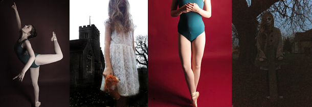
These are some inspirational images that have helped me develop my idea. Although they are not exactly how I want my shoot to be, they have similarities and have given me ideas to develop my shoot. The church is similar to the type of church I want to use for my shoot, as it looks old and is surrounded by trees and gravestones which make it look more eerie. I like the image of the girl as she is blonde, and I want my model to be blonde as it makes her seem more innocent to contrast with the creepiness. I also like the angle of the photo and the position the girl is in.


To prepare I need to;
·         Find a church to use as my location
·         Find someone to be my model
·         Plan what I want them to wear
·         Plan the make up
What I hope to achieve; 
During this shoot I plan to take various photographs from different angles and of different poses to show form, tone and colour. This shoot will link to my some artists I have researched as it links to the morbid and gothic style of their work.

What I actually achieved;                                                                                              
 Overall, I am happy with how my shoot turned out, as the location I chose worked really well with the idea, and the model looked exactly how I wanted her too. My photographs showed form and tone, not so much colour, other than the contrast of the white of the dress, the blonde hair, the rose and teddy against the dark background and makeup.  My favourite photographs were where the angle was looking up at the model, as it made her look more significant and eerie. Although I got some good photographs, some came out just black due to lighting; this means that in future if I do a similar shoot I will have to do it a bit earlier in the day.
This shoot went good, and nothing during the shoot, and the location, model, props and makeup worked well and the overall result was good and nothing compromised my shoot. This shoot gave me ideas on how to develop my shoots and expand on my current ideas to link everything. My favourite thing about this shoot, is how nothing in it makes it seem modern, as there is no street lights of anything visible, which I think helps create a old, eerie feel.


This is my favourite photograph from the shoot. I like this as I like how it shows depth due to the model being so far forward, making her look bigger than the church, enhancing  how she is the focus of the shoot. I also like the angle, which is looking up at her, so it shows her looking down, and that along with her position add to the eeriness. When editing, I done three different edits for this, one where I liquefied the background, and kept the colour and darkness consistent, and two like this. The other shows the model slightly darker. I like this one best, as she is brighter, and shows more colour in contrast to the church and background.


I like this photograph as it is closer up and shows her face more. I like how she takes up most of the composition, but there is still some of the location shown which is crucial as it adds to the photograph and without it, the photograph does not feel as creepy. I like how the roses are part of this as well, as they add some life contrasting the dark, dead feel. I like the position of her head, as it shows enough of her face, but her hair covers it slightly making her seem more mysterious. When editing this photograph, I made it slightly darker, and enhanced the contrast. I also made the roses brighter, so that the eye is drawn to them slightly. I did this as without the colour, they would not be as noticeable and would in a way be a bit pointless.


I like this photograph as I think out of all of the photographs this is the creepiest. I think this because the way she is standing holding onto the cross protectively. I think the fact that the cross is very simple and wooden, is what makes it seem to creepy. What also adds to this effect I think is the fact the model looks quite alone, as other than the tree and church in the background there is nothing around her. As in the first photograph, the angle is looking up at her slightly. When editing this, I just made it darker, then brighter.  I wanted to keep this quite simple, without over editing the colour, as I think in its own it is quite an eerie photograph due to just the composition and what is in it.


What I am going to do next;                                                                     
 When doing this shoot I got the idea to do a contrasting shoot, where I use the same model and a similar idea, but make it happy and bright, which contrasts the eerie, dark theme of this shoot. I am also going to do a contrasting shoot for my previous shoot. I am going to use this as a main theme to run through all of my photographs. So for every shoot I will do another one using the same model and a similar location and idea, but it will have the opposite effect.
No comments:

Post a Comment