For this shoot, I am going to do
a more realistic shot in contrast to y previous shoots, which have had more
unrealistic themes. This time I am going tp be doing more of a grungy, rock
fashion shoot. I am also going to be using male models this time instead of
female as in my previous shoots. This shoot should show form and tone. I will
be doing this shoot in the studio.
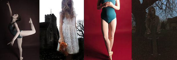
Although neither of these photographs show exactly what I want to
do for my shoot, they both contain different ideas I am putting into it. The
photograph on the left by Viona Ielegems relates due to the rough, grungy feel
of it and the way the model looks slightly scruffy. The photo on the right
relates as it is in the studio, and I like the idea of the photographs being in
black and white, which is something I may do when editing.
To prepare I need to;
·
Get some models
·
Plan what I want them to wear
·
Book the studio
·
Get props
What I hope to achieve;
During this shoot I plan to take photographs showing form and tone
and representing grungy/rock fashion. I want to take from different angles and
with different amounts of light to show the models and the idea in different
ways. I hope from this I can develop it further with a contrasting idea.
What I actually achieved;
During this shoot I managed to get the results I wanted and am
happy with how my shoot turned out. My photographs show form, tone and depth. I
created the scruffy/grungy/rock fashion shoot with the use of clothes, makeup
and props. To enhance the look I used a white background to show the dark
colours more. I created different amounts of shadow by experimenting with different
amounts of light by having both lights on, and trying with one on from both
angles. I don’t have a specific angle or distance which produced better
photographs and I have a range of different ones, such as just the models face,
and full length.
When editing, I kept the photographs fairly natural, and just
touched up some areas, and desaturated and added more contrast to the
photographs. I didn’t want to over edit the photographs so they stayed looking
realistic.
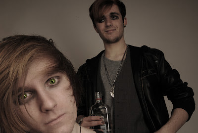
This is my favourite photograph from the shoot as it is similar to
one from a Nirvana shoot where I did get some ideas for this shoot from. I like
how this shows depth due to one model being quite close to the camera and the
other being further away. I like how the composition is filled well. When
editing I made it slightly lighter, but increased the contrast. I also
desaturated it, but not so that I lost the colour. I enhanced the green on the
focus model, which I think adds to the photograph as it makes it seem more grungy
relating to the use of alcohol and cigarettes during the shoot.
I like this photograph as the model looks quite distressed and disorientated.
I like how the model fills the composition and is partly cut off. I like how
this one is quite natural and the model is not looking at the camera making it
seem more off guard shot. When editing this I wanted to keep it natural so I just
used curves and levels as I thought the photograph didn’t need over editing. I
did make the area around his eyes darker though to enhance the grungy look I
was going for.
What I am going to do next;
From this shot I want to develop it and add a contrasting idea
using the same models but different idea. I want to create a more posh, Chelsea
look to show the complete opposite idea. I would keep the background the same
and the models the same as I have in my previous contrasting shoots.


No comments:
Post a Comment